Friday, March 16, 2012

Finished piece


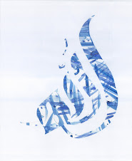
Recycle.


I know, its not a traditional English script, but it does say recycle.


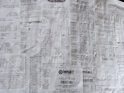
The word was cut from the mosaic and glued onto a background of receipts.


Our consumer culture front and center for art. Bright packaging + receipts = Art Work. I like it. I like it alot.


I prefer this version, though. The word recycle is here in negative space, cut from the mosaic. It is hard for our eyes to trace the pattern of the word. The repeating pattern tends to capture our brain. Add to that, the fact that the word Recycle is in a non traditional script.


Recycling can be hard to locate. We have to work thru our long held assumptions, to view the world thru fresh eyes.

Save a receipt, save a tree

I was at UTA, buying my snacks to get me thru another long class.

"Do you want your receipt with that?" the young lady behind the counter asked me.

"No." I shook my head.

She nodded. "Save a receipt, save a tree."

As I walked out that phrase stuck with me. Receipts are fluttering all over the place. Most of the time they collect in my purse, wadded up at the bottom. They become trash.

I started collecting my receipts, not sure what I was going to do with them. Save a receipt, save a tree.

Today the receipts became the background for my artwork.

A modern mosaic

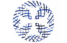
A modern mosaic. Done in the Islamic style. Six point stars. Everything cut from local material.

I'm struck by how different this does look from a traditional mosaic. Though the pallet is always deep with saturated colours, these colours are so much brighter. The color choices are traditional Islamic colours. Blue, purple, green, yellow, orange, red, and brown. I wanted to use the amazing silver, white and pinks that I've collected, but they simply don't go with traditional pallet. The colour are so much brighter than you would traditionally expect.

Modern marketing for ya!

Thursday, March 8, 2012

Can you find your snack?

How many of our beloved snacks can we identify in this form?
I see Coke, Starbucks, Mountain Dew, Dr. Pepper, Cliff Bars, Granola Bars, Chex mix. What do you see? Here, let me help some more.

Sunday, March 4, 2012

Lots of cutting, lots of glueing

Today I began the process of adding the "trash" to the art piece. It was alot of very precise cutting. And now you can start to see what it's going to look like.


What I like the most is that I can still recognize where each of the bits of color came from. When I cut up the cans of Monster, a few of the pieces had the logo on them. The Starbucks logo is still recognizable even when its cut just down to a small square.


I'm thrilled that I was able to get some of the "please recycle" logos off of various items and onto the piece. I know I've got two at this time.

Thursday, March 1, 2012

Laying out the patterns


I've been involved in the tedious task of laying out a mosaic pattern on a piece of paper. I layed down the pattern, and then used carbon copy paper to carefully get the pattern onto my piece of paper.


Once the pattern was on the paper, I then had to lay out the word "Recycle". In the end I'm going to have to cut out the word recycle, and I need to make sure that I don't have any metal pieces in the area that has to be cut. So, to insure that I can cut thru the final product, I laid the word out on top of the pattern. Again, using Carbon paper, I traced the word onto the paper.


Finally, once both guidelines were on the page, I actually colored in the paper with colored pencil. With these complex mosaic patterns, I have accidentally painted a square the wrong color before. When I previously worked in water color I made that unfortunate mistake. With glue, that could be a disastrous mistake. So, to prevent it, I colored in the paper. If you look closely you can see the lines for the word "recycle," but at this stage they are purposefully very light. Just so I can keep track of where I am in the piece.