Sunday, March 4, 2012

Lots of cutting, lots of glueing

Today I began the process of adding the "trash" to the art piece. It was alot of very precise cutting. And now you can start to see what it's going to look like.


What I like the most is that I can still recognize where each of the bits of color came from. When I cut up the cans of Monster, a few of the pieces had the logo on them. The Starbucks logo is still recognizable even when its cut just down to a small square.


I'm thrilled that I was able to get some of the "please recycle" logos off of various items and onto the piece. I know I've got two at this time.

Thursday, March 1, 2012

Laying out the patterns


I've been involved in the tedious task of laying out a mosaic pattern on a piece of paper. I layed down the pattern, and then used carbon copy paper to carefully get the pattern onto my piece of paper.


Once the pattern was on the paper, I then had to lay out the word "Recycle". In the end I'm going to have to cut out the word recycle, and I need to make sure that I don't have any metal pieces in the area that has to be cut. So, to insure that I can cut thru the final product, I laid the word out on top of the pattern. Again, using Carbon paper, I traced the word onto the paper.


Finally, once both guidelines were on the page, I actually colored in the paper with colored pencil. With these complex mosaic patterns, I have accidentally painted a square the wrong color before. When I previously worked in water color I made that unfortunate mistake. With glue, that could be a disastrous mistake. So, to prevent it, I colored in the paper. If you look closely you can see the lines for the word "recycle," but at this stage they are purposefully very light. Just so I can keep track of where I am in the piece.

Saturday, February 25, 2012

Recycle is a foreign word

Today in class our professor was talking about "green" issues. We discussed how they can improve the bottom line for the company. How they can help to generate good press for companies. Even when most people only have a marginal interest in environmental issues, seeing that a company is green will create a positive mental image for most people.


"How many people will only buy from green company?"


We all sat there questioning ourselves. No matter how green I say I am, I'm not that stringent.


"Who doesn't care?"


One hand shot up.


I looked at my classmate thinking this thru. This classmate always donates recyclable "trash" to my bucket. He might not care about recycling, but when I made it really easy for him to recycle, he does.


As I left class another classmate asked me if I had enough in my bucket. I smiled, saying I always want more.


"So what you're saying is you want us to waste more?"


"It's not waste! It's recyclable stuff!"


"But it's our waste."


"For me, it's my resources as an artist." This art project is governed by what "trash" I manage to collect.


What is waste to one person, is a precious resource to another person.


Recycling is a foreign word to most people. Waste is waste. It's a left over that needs to be thrown away and cleaned up. But when its easy, even people who could care less will recycle.


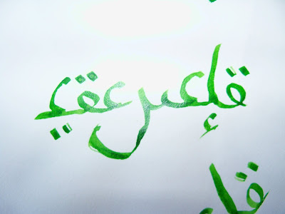
Believe it or not, this is actually an English Calligraphy Script. It will be part of my next art piece.

One art piece completed!

I'm so happy! I've got this piece completed. And it looks really good. Now all I need to do is get it framed.

I would be even happier, but I discovered that I had flipped the image! That's what I get for taking a picture! The solid and white sides of the star should be flipped. If I had the time, I would redo the image. But I don't. The piece is due in April. And I've got at least one other image that I want to do for this contest.

I love the rich colors! The blues and oranges are so bright and vibrant. That is the one thing I love about advertising, they always use such rich colors.

Thursday, February 23, 2012

The end is in sight!


Tonight I got even closer to being done. The yellow is hard to glue. It is small percise lines of yellow/orange that make the star. It's not like the blue that covers huge swaths of territory. I had so much glue on my fingers tonight that I had to stop to simply clean my fingers.


But the blue is finished! And only the yellow/orange remains. I love the way it looks.

Wednesday, February 22, 2012

Adding color

I've begun the process of adding color to UTA's logo. This is the first time I've worked with truly mixed media for a collage project. I had to buy new glue. Elmers simply won't hold cut up allumin soda cans to paper! And I have no clue what sticking power Elmers would have with the plastic wrappers off water bottles.


I'm making progress. It takes a while to get everything glued in place, to fit everything together.


As I was uploading these pictures, looking at the small thumbnails, it was really amazing to see how the image popped out, to see the clear lines created by the color. Even if the color is a mosiac.

It's actually turning out really well!

Tuesday, February 21, 2012

Got the UTA Logo!


I needed the UTA logo for this project. One good picture later, logo captured. Even if it was backwards. Oh well, so what!


I got the logo printed. FedEx Kinko's was kind enough to englarge the logo. I then put some carbon paper underneath the logo and began tracing it.


I traced the logo onto a large piece of paper.


And voila! Now I will begin filling in the logo with the recycled trash from my class!