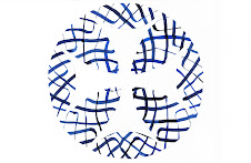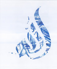
Not quite Kufic. Well, not even close to Kufic. I love the simple style of this calligraphy. For this piece, the lack of the vowel markings made it very attractive. It means that all the emphasis is placed on the mosiac pattern in the middle of the word.


No comments:
Post a Comment